Siph wrote: Mon Jul 28, 2025 7:51 pm
So I’m not going to insist or anything because again ultimately it’s not a big deal, nor is it a deal breaker at all! But I still do think it feels counter-intuitive to me and it also goes against with the way letter icons have pretty much always been used skeumorphically in all software I’ve ever seen before.
Though I gotta say, if they were custom made, they do look pretty nice.
They were in fact made by one of our admins, Necrotext!
At some point, we could revisit their design. But for now, they are likely to stay.
Siph wrote: Sun Jul 27, 2025 10:27 am
[EXTREME NITPICKING] I’m using the 1982 theme and I’m a bit confused by the read/unread icons. The "read" icon is a closed letter and the "unread" icon is an open letter. Shouldn’t it be the other way around? Like, doesn’t it make sense that open letters are ones you’ve already read, while closed ones are ones you haven’t read yet?
This was brought up earlier in the thread but I'll quote my response then.
Me, back a page wrote:Our thought process on it was basically "Letter in the envelope indicates that there is something to read inside and the closed envelope is something you are done with in that you've read what was inside." Maybe not exactly how one would keep mail, but the letter in the envelope is more eye-catching as something new that you should look at versus the closed envelope.
We could swap them around, but I don't know if other people are also having this problem.
I admit it has caught me out as well. It's mostly just from a UI thing in general that a lot of mail apps follow the same logic of "closed = new". I've gotten used to it now, but yeah earlier on in use it did catch me a lot more
Screenshot 2025-07-29 052532.png (4.33 KiB) Viewed 660 times
If not autumn themed, Ctrl+F5! ¦ Left: HAJiME, Right: Donryu
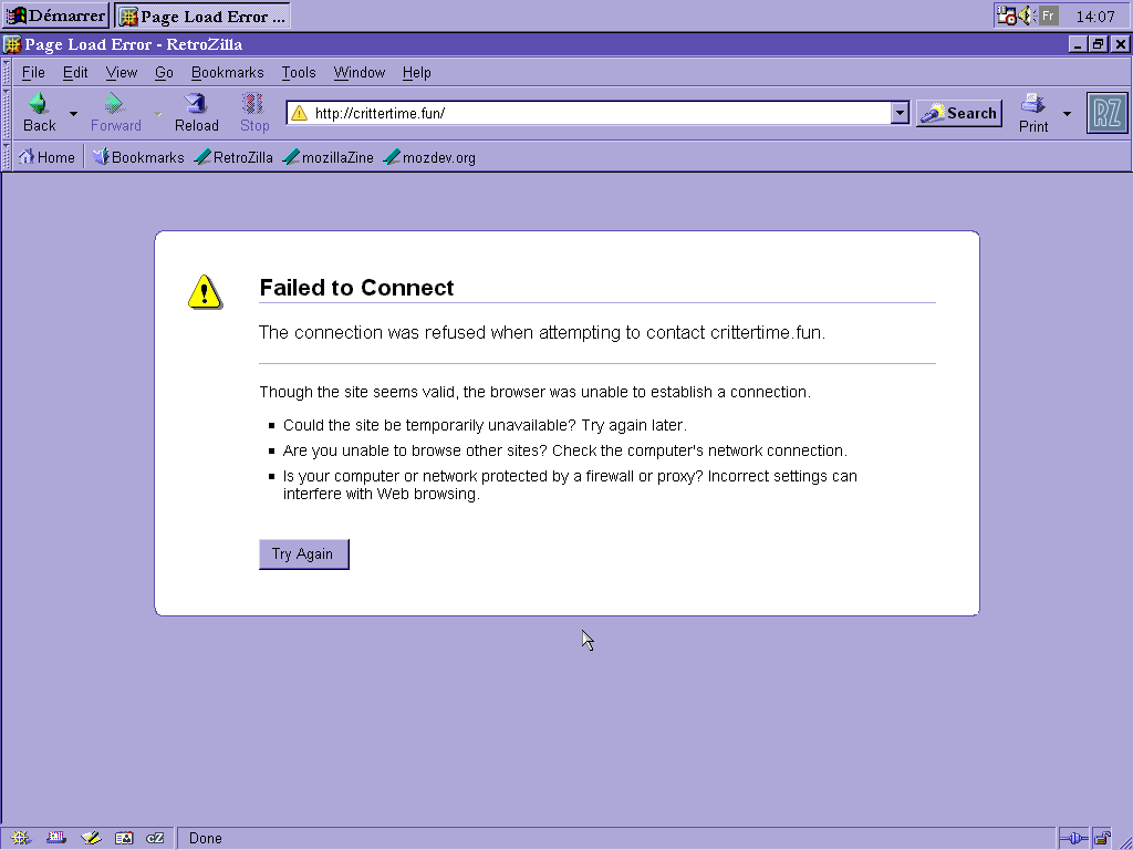
Hey, I’m noticed that I’m not able to connect to the forum using RetroZilla :
I understand this might be because of security measures. Do you think it could be possible to make an exception for RetroZilla? I’m big into retro computer/OSes right now and since it’s phpBB2 I’m pretty sure it would render decently.
Siph wrote: Fri Aug 08, 2025 12:09 pm
Hey, I’m noticed that I’m not able to connect to the forum using RetroZilla :
I understand this might be because of security measures. Do you think it could be possible to make an exception for RetroZilla? I’m big into retro computer/OSes right now and since it’s phpBB2 I’m pretty sure it would render decently.
If that’s not possible, I completely get it!
It's either that or something throwing a HTTP 500 error, I'm not super comfortable making security exceptions when I'm not 100% certain what's causing the issue.
Addendum: Looks to not be a 500 error, but I was looking at the logs and it seems I'm getting a lot of security notes. Not sure what to do to fix it. And I'd rather not leave open anything that could be an attack vector.
beeps wrote: Mon Aug 18, 2025 9:57 pm
Interesting bug I found whilst posting earlier, formatted text inside of links has the spaces around them stripped out.
Which theme do you use out of curiosity?
I know from trying to edit the themes that the CSS was a little wonky regarding spaces and am curious what the scope of this might be.
Base 1982, not one of the dark/readable versions.
Hmm, seems to be a bug in the 1982 theme period. Unfortunately, I couldn't find a CSS fix and I'm not versed enough in how themes work here to dive deeper into the person's who made this' work so I don't really have a solution. Apologies but I did see this doesn't happen in the other two themes.
How feasible would it be to add an outline or glow to forum posts' colored text for readability when the text's color is sufficiently similar to the theme's background(s)?
ElTipejoLoco wrote: Wed Aug 20, 2025 12:14 am
How feasible would it be to add an outline or glow to forum posts' colored text for readability when the text's color is sufficiently similar to the theme's background(s)?
I don't think I have anything like a hook or anything for color text specifically. I could take another look at some point, but I'm not sure how to do that just for color test.
Something I think would be cool would be a Forum Games section, for things like play-by-post TTRPGs and chess and Mafia, and stuff like those threads where you count upwards one by one.
JerryEris wrote: Sun Aug 24, 2025 8:16 pm
Something I think would be cool would be a Forum Games section, for things like play-by-post TTRPGs and chess and Mafia, and stuff like those threads where you count upwards one by one.
I think this is something we can do if enough people express interest for it, but I'd rather not add another subforum until there's a demand. If more people want it, please let us know.
"If you see me, please just walk on by, walk on by
Forget my name and I'll forget it too."